
Optimizing Placements of Call to Action and Content Layout
There is a cool tool offered from Google Labs that allows you to visualize browser window sizes for people who visit Google. Using your web analytics tool, you could know the percentage of visitors who are able to view key elements on your site when they land on the site.
If that tool is no longer available, then you can always use a heatmap tools like HotJar, CrazyEgg, or Mouseflow to understand the exposure of your web page.
In this example, Google’s browser size will show you a line with “90%” contour, which means that 90% of people visiting Google have their browser window open to at least this size or larger.
With more internet users’ attention span and focus getting narrower, these tools are very useful to optimize your site to improve the outcome.
Here is what it looks like when you use it on Amazon’s Kindle product page.
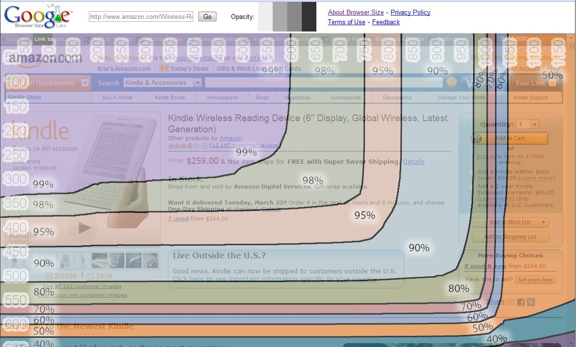
My screen resolution was set to 1280×800, and the page with Google Browser Size resolution marks account for browser and my Windows vertical toolbars.
What’s interesting is that according to this overlay, it tells us that with this browser size setting, 50% of the Google visitors who visit this page will see partial “Add to Cart”, “Add to Wish List”, and “Add to Shopping List” buttons.
Using your web analytics tool (Google Analytics, WebTrends, Omniture, etc.), you can gain additional perspective on what your visitors will see for your site, including visitors who come from Google. Your web analytics data will allow you to understand where your visitors are likely to fall under in these marks accounting for Google’s visitors who are likely to be more a major contributor of site traffic.
Taking this page as an example; hypothetically, let’s say the majority of Amazon’s visitors set their browser size to 950×500, that means, according to Google’s data, 90% of the Google’s visitors set their browser at least in this resolution.
Another example, if the majority of Amazon’s visitors set their browser size to 1280×800, then 50% of Google’s visitors will at least have this browser resolution.
At the end of the day, your site visitors and their screen resolutions are what matters the most. However, considering that Google is one of the most visited sites in the world online, that is also telling you what resolutions are likely to be optimal. And that should matter to you if you are trying to acquire more visitors to your site.
Segmenting your resolution size data by traffic source could give you a different perspective as well. Reason, why we should take these different perspectives into consideration, is; consumers could and most likely start their search from Google (or other search engines), go directly to your site by typing the URL directly into the browser, to research before purchasing your product on your site, or follow the links thru various sites starting from search engines.
This Google tool can give you additional view on what general audience have their browser resolution set, and give you a good sense on how optimal your key call-to-actions are positioned within the site to search general mass online audience.
With more and more consumers going online using browsers thru mobile or iPad like devices, the resolution size is likely to get smaller. Taking screen resolution into your content layout strategy will be even more important than before.
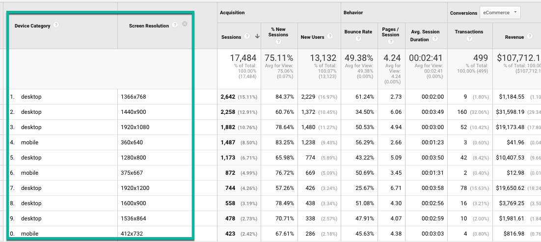
Here is a custom report in Google Analytics that shows you the screen resolution per device type. It is very useful to see your performance measures and possibly find opportunities to optimize your site’s UX.
Here is the link to Google Labs’ Browser Size: http://browsersize.googlelabs.com/
Thank you so much for taking the time to read my content. If you've liked what I've had to say please subscribe!

ZoomMetrix Newsletter
Join the newsletter to receive the latest updates in your inbox.