
Effective Executive Reporting Dashboard for Web Analytics
Regarding an effective executive reporting dashboard for web analytics, I often read about discussions on what could be a great dashboard or that one best executive summary slide could be.
In reality, there is no such thing as a perfect dashboard that meets everyone’s requirements. The dashboard will be catered to someone who needs to know the bottom line, who could be the decision-maker, most important person in the company or team, etc.
With various business units supporting the entire online business, it is pretty much impossible to satisfy everyone with one dashboard.
When a dashboard is shared across different teams, a specific group with special interests will start to ask more than what is on the dashboard because their job duty is to support specific tasks within the business life cycle of the online business.
On some occasions, when you create a web analytics dashboard for the CEO, you’ll always hear from another team manager saying that that dashboard doesn’t help “me” in any way and then starts to give an idea of what they want.
In a typical scenario, an honest and hard-working web analyst will try to make everyone happy, so they make either an obese dashboard containing many colorful charts or a bunch of redundant reports catered to every single manager in the company.
You think a website with one goal or objective would have a clear and simple dashboard for all to accept easily created, but it could get tricky. I believe it is important to think of the dashboard as a starting point to dive into a data pool.
The best way to create an effective dashboard
You should consider the following points:
- Understand the bottom line and the desired outcome of the website.
- Ask why each key business unit exists and what would be their most important questions that need to be answered?
- Know the kind of decisions your end-users or business partners can make based on your dashboard.
Effective dashboards usually include:
- An intuitive graphical display that is thoughtfully laid out and easy to navigate.
- The logical structure so information is easy to consume.
- Regular and frequent updates of the dashboards for relevance to current conditions.
- Answer fundamental questions about the website’s goal or overall business unit.
- It alerts issues or problems in such areas (error pages, ROAS, revenue, conversion rate, etc.)
- Supports decisions that impact the business.
Killing multiple data needs with one dashboard
I am just using this phrase to push the minds to think effectively to report KPIs effectively to reduce redundancy.
Check out this image of a scenario where you have multiple business units involved in a website. Where data needs where one Executive Dashboard created to make the CEO smile.
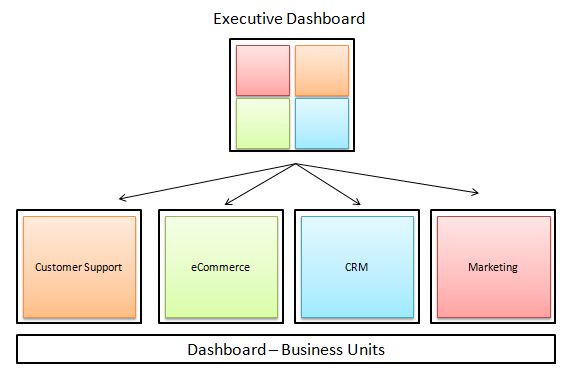
The images may imply that web analysts will need to make five dashboards at the end of the day.
However, if you craft the dashboards effectively, you could consolidate them into fewer reports. Of course, how you do that will depend on the web analyst's skill to work with those key players and identify the KPIs for actionable insights.
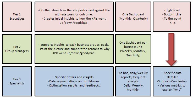
Here is a basic framework that I crafted to support creating that awesome web analytics dashboard. Tier 3 is not necessarily a dashboard, but most likely a report or an ad hoc analysis.
It is intended to demonstrate that your dashboards and reports should be positioned and focused on catering the KPIs to appropriate audiences and showing different audiences' tiers, reflecting organizational structure with a distinct focus on reporting needs.
Side note: If you give web analytics access to each business unit and allow one smart and motivated person to do their team's web analytics support, you can build allies of web analytics specialists. This could be a long-term strategy to build a web analytics culture within your company so that you can scale and focus on the big problem you can help solve. You don't want to be answering many questions that seem important.

ZoomMetrix Newsletter
Join the newsletter to receive the latest updates in your inbox.